Case Study & Web Development

Designed an AI Learning Tool That Reduced Cognitive Overload for Neurodiverse Electrical Apprentices

My Role

Co Product Owner

Lead Product Designer

Team

5 designers

2 developers

Timeline

Sept. - Dec. 2026

Tools

Figma

Illustrator

Jira

Got It document previewGot It interface preview

Overview

About the Project

One in five Canadian apprentices never finishes their trade program. Not because they lack skill but because the materials designed to teach them were never designed for how they actually learn. Dense code books. Jargon-filled manuals. No visual aids. No structure. Just pages of small text and the expectation that students will figure it out.

Got It is an AI-powered study tool built specifically for electrical apprentices in British Columbia, with a particular focus on the neurodiverse learners who make up a significant, often invisible, portion of every cohort.

How I Led This Project

As Co-Product Owner and Lead Product Designer, I led this project end-to-end: defining the problem, scoping the MVP, guiding research, making hard prioritization calls, and shaping every major design decision.

The core product decision that set us apart: instead of building another open-ended AI chat tool, we sandboxed our AI to the Canadian Electrical Code. Every output is grounded in verified source material — because for trade workers, inaccurate information isn't just frustrating. It's a safety issue.

Only 19–20% of Canadian apprentices complete their programs on time. Up to 44% drop out entirely within six years. These aren't engagement problems. They're design problems — and we set out to fix them.

Research

Research Methodology

As Product Owner, I defined the research direction and ensured findings directly informed product decisions. Research combined qualitative and quantitative methods:

  • Interviews with trade workers and electrical apprentices
  • A user survey on study habits, pain points, and existing tools
  • Heuristic analysis of existing AI study tools and educational platforms

I intentionally scoped the project to one trade—electrical—to ensure accuracy, depth, and relevance before considering expansion to other trades.

Talking to Real Apprentices

Interviewing a BCIT Master Electrician Instructor and electrical apprentices gave us direct insight into how learners navigate dense code material and where they need support. These conversations grounded our design decisions in real study behaviors and pain points.

Key concerns from interviews

  • High presence of ADHD and autism among trade students
  • Dense, theory-heavy Level 1 content contributes to early retention issues
  • Manuals and code books are heavy in jargon and emotionally disengaging
  • Terminology in manuals often does not match how concepts are taught or practiced
  • Jargon and terminology inconsistency are major barriers
  • Misinformation from online sources (YouTube, forums) creates risk and confusion

Possible solutions from interviews

  • Glossary & vocabulary tab: reduce jargon and acronym overload
  • Structured breakdowns: step-by-step, scannable content
  • Simplified summaries: grounded in a sandboxed code source
  • Visuals and examples: support for non-text learning preferences

Survey Findings

We conducted surveys with electrical apprentices to understand their study habits, main struggles, and the tools they use. Common difficulties included not knowing where to start, organizing information across sources, and learning from dense, jargon-filled textbooks—all of which contributed to cognitive overload.

These insights confirmed the need for a tool that helps apprentices simplify and structure their notes while maintaining accuracy.

Key concerns from survey

  • Difficulty learning from dense textbooks filled with jargon and acronyms
  • Large blocks of small text make it hard to focus and identify key information
  • Math and the Canadian Electrical Code are the most overwhelming subjects
  • Uncertainty about where to start when studying
  • Struggles organizing notes across manuals, worksheets, and PDFs
  • Many learners (6/8) reported ADHD, dyslexia, or other learning challenges

Possible solutions from survey

  • AI-Powered Summaries: Converts user notes and Canadian Electrical Code content into smaller, structured sections
  • Mind Map Generation: Transforms content into visual overviews to support conceptual understanding
  • Personalized Study Guide: Helps students know where to start by breaking content into clear, digestible sections
  • Accessibility Controls: Adjustable text size, contrast, and dyslexia-friendly options
  • Integrated Pomodoro Timer: Encourages focused, distraction-free study sessions

What Already Exists

We analyzed seven competitors, including AI summarization tools and trade-specific study resources, to understand what was already available.

Most AI tools could summarize information, but they were not built for neurodiverse learners. Their interfaces were overwhelming, and their answers were not always reliable for regulated trade content. Because electrical standards vary by region, generic AI tools often pulled incorrect or irrelevant information.

Trade study resources were accurate, but they did not help break down dense code into smaller, easier sections to study.

Two clear gaps emerged: AI tools were not trustworthy enough for trade studying, and trade resources did not simplify complex material.

This reinforced our decision to avoid building an open chat tool and instead design a structured study experience grounded in the user's own materials.

Who We Designed For

Using insights from the competitive analysis, interviews, and survey, two primary personas were developed to represent Got It's target audience, ensuring the team addresses their specific needs and challenges.

What the Research Told Us

Learning & Cognitive Load

  • 6/8 participants reported a learning disability (ADHD, dyslexia, or self-identified)
  • All participants with learning disabilities struggled with textbook-based learning
  • Learners take longer to study than peers and still feel unsure about the material
  • This leads to frustration, burnout, and demotivation

Studying & Organization

  • All participants feel unsure where to start when studying
  • Most struggle to organize information across manuals, worksheets, and notes
  • Dense content makes it hard to identify what is actually important

Content Challenges

  • Math and the Canadian Electrical Code are the most difficult topics
  • Large blocks of small text, jargon, acronyms, and technical language cause cognitive overload
  • Learners want visuals, examples, and simplified explanations

Existing Workarounds

  • Breaking down text manually
  • Highlighting and rewriting notes
  • Watching YouTube tutorials to understand concepts
  • Preference for hands-on, step-by-step, and visual learning

Design

Restraint as a Design Principle

Research gave us a long list of problems. My job as Lead Product Designer was to resist the urge to solve all of them. The biggest risk at this stage was not under-designing. It was over-designing. Building a feature-heavy tool for people who were already cognitively overloaded would have made things worse. So I set a clear design philosophy before a single wireframe was drawn.

As Lead Product Designer, I translated research insights into a focused MVP. My core design principles were:

  • Reduce cognitive load at every step
  • Limit feature scope to avoid overwhelm
  • Prioritize clarity, structure, and predictability
  • Design for trust through transparent, verified data sources
  • Use a restrained visual system—no distracting colors unless they serve a clear functional purpose

The key product decision was allowing users to upload their own notes and generate simplified versions grounded in the Canadian Electrical Code.

4 key features to address user pain points (based on survey results)

Upload or Select Material

Upload your own notes or pick a built-in textbook. Everything stays accurate because AI only uses the CEC.

Simplify or Summarize

Turn dense text into easy-to-read versions or quick summaries.

Generate a Mind Map

See content visually and plan your study around your exam date.

Personalized Study Guide

Helps students know where to start by breaking content into clear, digestible sections.

Dual View

Compare original and simplified text side by side.

Visual Design & Style Guide

The visual system was intentionally minimal and calm, using:

  • Clear hierarchy and spacing
  • Limited color palette
  • Simple typography optimized for readability
  • Interfaces designed to feel supportive, not technical

The goal was to create an environment that felt safe, focused, and non-judgmental for learners who already feel overwhelmed.

Information Architecture

The Site Map structured the website for clear navigation, enabling easy access to note uploads, simplified summaries, and side-by-side comparison. Since all surveyed apprentices study on laptops, we chose a web-based platform to match their workflow.

GotIt sitemap

Low-Fidelity Wireframes

Final Product

High-Fidelity Screens

Reflection

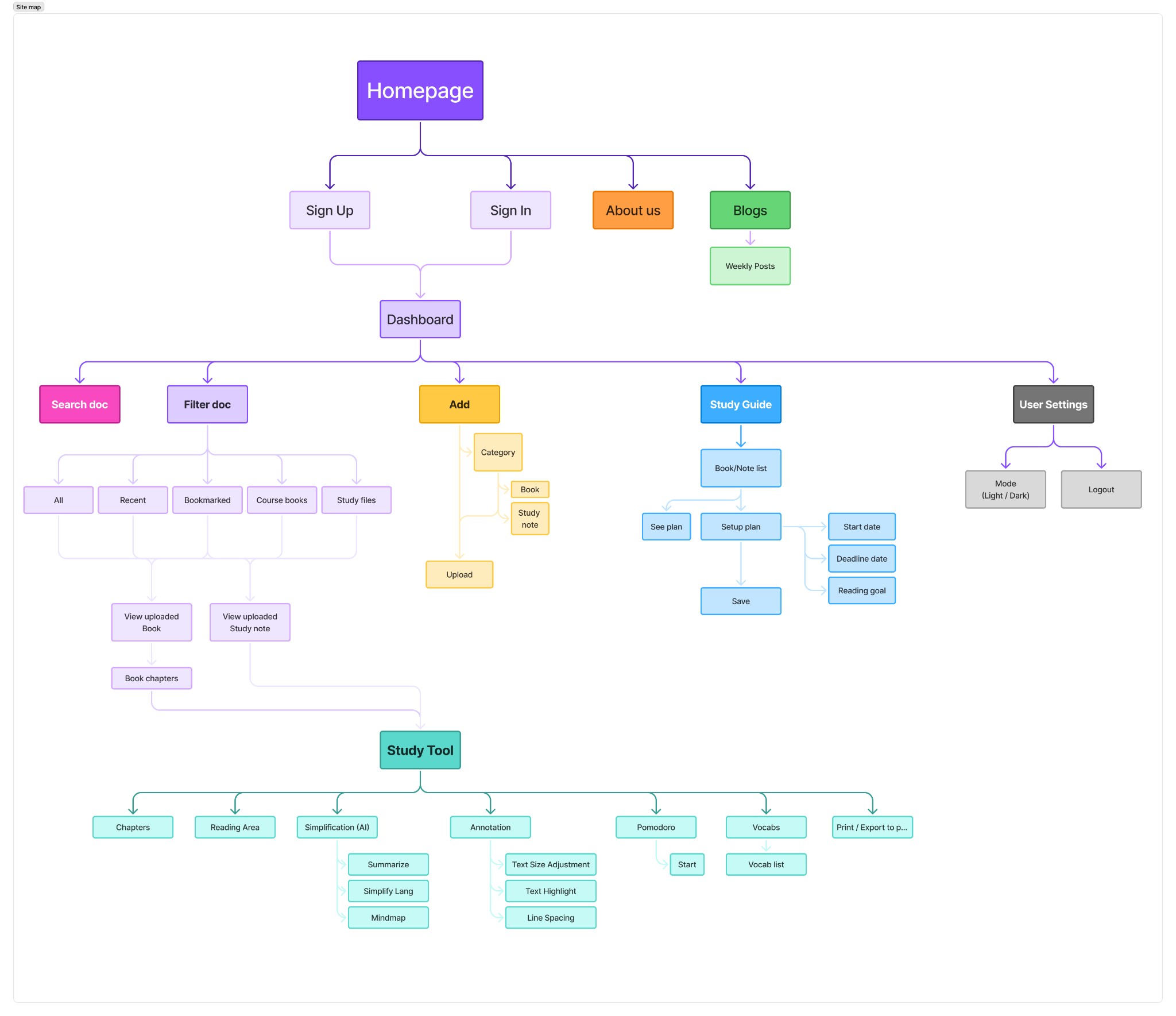
As Co-Product Owner and Lead Product Designer, during the initial research and ideation phase, I felt overwhelmed by the number of issues uncovered through surveys, interviews, and competitor analysis. The problems were layered and systemic, and I questioned how we could realistically address them within a single product.

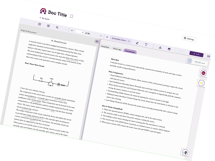
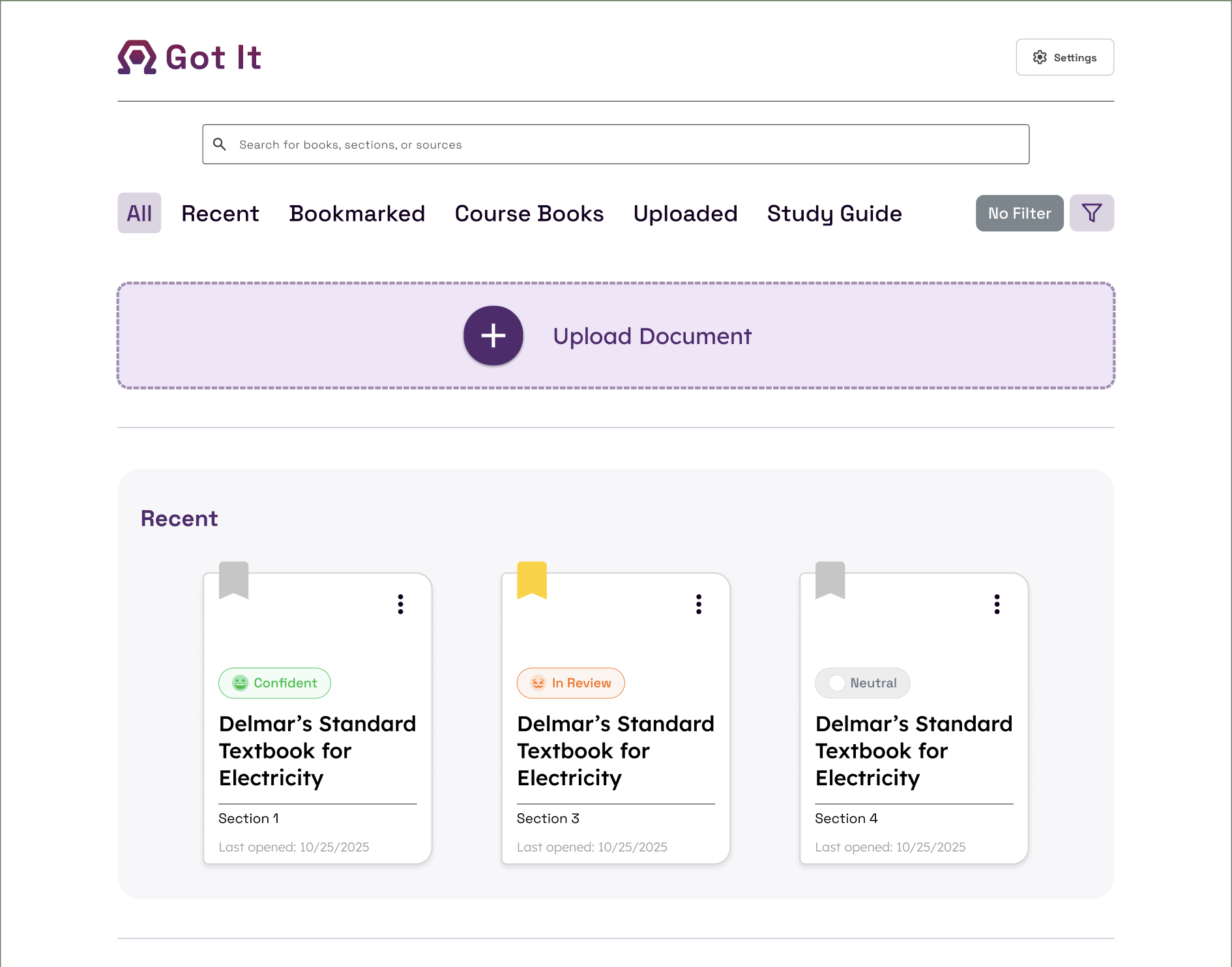
To regain focus, I prioritized the highest-impact challenges and defined clear scope boundaries. Instead of trying to solve everything, I focused on core features that directly reduced cognitive overload and improved study clarity. This iterative approach helped shape Got It into a focused, lean prototype grounded in real user needs.

Through this process, I learned how critical it is to separate important problems from urgent ones. As a leader, I had to make decisions that balanced ambition with feasibility, ensuring the team stayed aligned and confident in the direction. I also realized that designing within constraints doesn't limit creativity—it sharpens it. By narrowing the scope, we built something intentional rather than bloated.

Ultimately, I learned that strong scope definition, disciplined prioritization, and decisive leadership are just as important as creativity when building meaningful, user-centered products.